Azure DevOps Work Item Hierarchy Reports in PowerBI

In this post I show how you can query Work Item data and build hierarchical reports using PowerBI.
- tl;dr Just give me the pbix file!
- Raw vs Aggregated Data
- Relating Tables
- State Category Order Tables
- Calculated Columns
- Slicers
- Conclusion
My colleague Josh Johanning and I were working with a team that is using Azure DevOps to track work. Their team lead was opening Excel and pulling in Work Item data and creating a feature timeline by hand. This process was manual, painstaking and error-prone. Josh and I set out to see if we could create the same report using OData and PowerBI.
tl;dr Just give me the pbix file!
If you just want the pbit file to hook up to a Team Project, you can grab it here. When you open it, you’ll be prompted to enter the URL of your Team Project OData endpoint and the name of the work item types for Epic, Feature and Story level respectively. The little i glyphs will give you help if you need it.
Raw vs Aggregated Data
To create the report we wanted, we need to aggregate work items along the hierarchy - typically Epic -> Feature -> Story. With OData feeds, you can apply aggregations like count of Features in Iteration X or sum of story points for Active Stories in Area Y. However, while this makes the query efficient, you’re hard-coding any filters, so creating reports with slicers won’t work.
In the end we decided to use a raw query - we’d get all the work items and then let PowerBI do the aggregation. Of course, if you’re doing a raw OData query like this, you don’t really want to get all work items: you want to apply some filtering, like AreaPath or IterationPath or State. You can read more about recommended query guidelines here.
The next challenge we had was how to relate the work items so that we could aggregate. After thinking about it, we decided to create three work item tables (and queries) to segregate work items by WorkItemType: so we ended up with an Epics table, a Features table and a Stories table. Initially we thought we’d have to create another query to the OData source to get WorkItemLinks and then relate parents to children using that data, but the default OData work item query conveniently adds a ParentWorkItemID column in so you don’t have to!
Let’s take a look at the Epics query from within PowerBI:
let
    Source = OData.Feed(ODataBaseUrl & "/WorkItems?$filter=WorkItemType eq '" & EpicWorkItemType & "'", null, [Implementation="2.0"]),
    #"Removed Other Columns" = Table.SelectColumns(Source,{"WorkItemId", "LeadTimeDays", "CycleTimeDays", "ProjectSK", "WorkItemRevisionSK", "AreaSK", "IterationSK", "AssignedToUserSK", "CreatedByUserSK", "Revision", "Watermark", "Title", "ParentWorkItemId", "WorkItemType", "ChangedDate", "CreatedDate", "State", "Effort", "StoryPoints", "TagNames", "StateCategory", "BoardLocations", "Teams", "Parent", "Iteration", "AssignedTo", "Tags"})
in
    #"Removed Other Columns"
Notes:
- Line 2 is using the
OData.Feedfunction to get data from an OData endpoint. I’ve created a parameter to the OData endpoint of the Azure DevOps instance calledODataBaseUrl- in fact, I’ve added the Team Project into the URL so that I’m only getting data from a single team project. After that, we’re getting/WorkItemswhich is the WorkItem entity set - but we’re filtering further by getting work items whereWorkItemType=EpicWorkItemTypewhich is another parameter that has the default valueEpic. - Line 3 is using
Table.SelectColumnsto select only certain columns, rather than bringing back columns that we don’t need. Under the hood, PowerBI is smart enough to apply “query folding” so theTable.SelectColumnsis translated into a$select=OData clause
We repeat this for the Features and Stories, but just update the work item type value that we’re filtering on.
Note: You should probably add a date filter (
CreatedDate > Today - 14 daysor something silimar) too, since this query could return a lot of data. Behind the scenes, PowerBI is automatically adding aTOP 1000but you still want to be optimal about what work items you’re getting via the OData query. In our case since we only had a single team project, we decided we didn’t need a date filter.
We then add in queries to some ancillary tables that we are going to use for filtering, like Areas, Iterations and Users. Here’s the query for Areas:
let
    Source = OData.Feed(#"ODataBaseUrl"),
    Areas_table = Source{[Name="Areas",Signature="table"]}[Data],
    #"Removed Columns" = Table.RemoveColumns(Areas_table,{"ProjectSK", "AreaId", "Number", "AreaLevel5", "AreaLevel6", "AreaLevel7", "AreaLevel8", "AreaLevel9", "AreaLevel10", "AreaLevel11", "AreaLevel12", "AreaLevel13", "AreaLevel14", "Depth", "AnalyticsUpdatedDate", "Project", "Teams"})
in
    #"Removed Columns"
Again we’re pulling data from the ODataBaseUrl, and then scoping the call to the table Areas (the query folding just ends up appending /Areas to the URL). We then remove columns we don’t need to clean up the table.
Relating Tables
At this point, PowerBI will automatically detect relationships - so it’ll create a link from AreaSK in the work item tables to the Areas table. However, it will create some of the relationships as Active (solid line) and that can mess up the next step. We need to update all the relationships (to Areas, Iterations and Users as non-active (they’ll now appear dotted in the Model view).
Once you’ve done that, you can add the following active relationships:
Story:ParentWorkItemID->Feature:WorkItemIDFeature:ParentWorkItemID->Epic:WorkItemID
State Category Order Tables
For our visuals, we wanted to show by state - or more accurately, state category. By default these are Proposed, In Progress and Complete. Unfortunately, category names on visuals are sorted alphabetically be default, so the charts always showed Completed first.
To work around this, we entered data to create a new StateCategories table with two columns: StateCategory and Order where the Order value was 1 for Proposed, 2 for In Progress and 3 for Complete. We created a new relationship from Stories:StateCategory -> StateCategories:StateCategory. We then tried to do the same from Features to StateCategories, but hit the “ambiguous relationship” issue (since Stories is already related to Features). We then just renamed StateCategories to StoryStateCategories. We then duplicated this table and renamed it to FeatureStateCategories and created the Features:StateCategory -> FeatureStateCategories:StateCategory link.
The final model looks like this: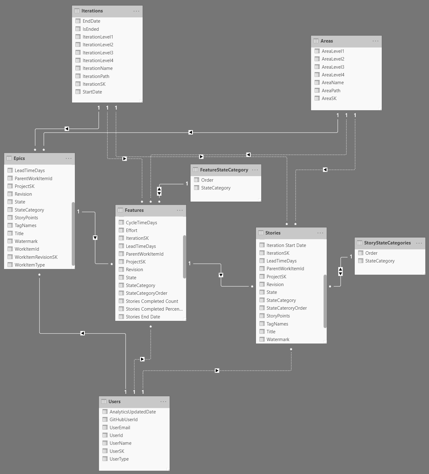
Calculated Columns
We then added the following calculated columns on the Stories table:
    Iteration End Date = LOOKUPVALUE(Iterations[EndDate], Iterations[IterationSK], Stories[IterationSK])

    Iteration Start Date = LOOKUPVALUE(Iterations[StartDate], Iterations[IterationSK], Stories[IterationSK])

    StateCateroryOrder = RELATED(StoryStateCategories[Order])
These are just lookups to bring in the related values so that they are all “inline”.
To utilize the StateCategoryOrder column, we click on the StateCategory column, and then click “Order By” and select StateCategoryOrder.
For Features the calculations were a little more complex since we were aggregating the Stories value. For each Features row, we can perform calculations on RELATEDTABLE(Stories): this is the subset of Stories rows that are related to the current Features row via the Stories:ParentWorkItemID -> Features:WorkItemID relationship. With that in mind, we create the following calculated columns:
    Stories Completed Count =
    VAR num = CALCULATE(
        COUNTROWS(RELATEDTABLE(Stories)),
        FILTER(
            RELATEDTABLE(Stories),
            Stories[StateCategory] = "Completed"
        )
    )
    RETURN IF(ISBLANK(num), 0, num)

    Stories InProgress Count =
    var num = CALCULATE(
        COUNTROWS(RELATEDTABLE(Stories)),
        FILTER(
            RELATEDTABLE(Stories),
            Stories[StateCategory] = "InProgress"
        )
    )
    RETURN IF(ISBLANK(num), 0, num)

    Stories Proposed Count =
    var num = CALCULATE(
        COUNTROWS(RELATEDTABLE(Stories)),
        FILTER(
            RELATEDTABLE(Stories),
            Stories[StateCategory] = "Proposed"
        )
    )
    RETURN IF(ISBLANK(num), 0, num)

    Stories Total Count =
    VAR num = CALCULATE(
        COUNTROWS(RELATEDTABLE(Stories))
    )
    RETURN IF(ISBLANK(num), 0, num)

    Stories Completed Percentage =
    var perc = [Stories Completed Count]/[Stories Total Count]
    RETURN IF([Stories Total Count] = 0, 0, IFERROR(perc, 0))

    Stories Start Date =
    CALCULATE(MIN(Stories[Iteration Start Date]))

    Stories End Date =
    CALCULATE(MAX(Stories[Iteration End Date]))

    AssignedTo = LOOKUPVALUE(Users[UserName], Users[UserSK], Features[AssignedToUserSK])

    StateCategoryOrder = RELATED(FeatureStateCategory[Order])
We’re calculating related Stories using a filter on StateCategory and just summing the count. We don’t use Story Points, but you could easily sum the Story Points column to do the same operation on Story Points instead of work item count. We then calculate a Completed Percentage. We then add in calculations for the earliest start date and latest end date for related Stories (via the Iteration). This gives us a start and end date for each Feature. Finally, we added in the StateCategoryOrder and the AssignedTo lookup: the AssignedTo relationship to the user table didn’t work as we expected, probably because we made the relationship inactive. Fortunately the lookup is simple.
We now have all the data we need for some visualizations!
Slicers
We first added some slicers: Area, Iteration, Epic State and Feature State and map these to Areas:AreaPath, Iterations:IterationPath, Epics:StateCategory and Features:StateCategory respectively.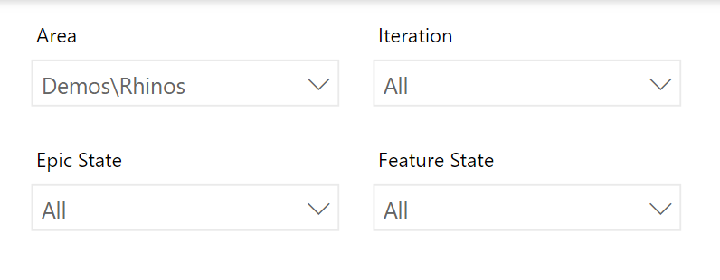
We then added a Donut chart to show the total count of Stories: we set the Legend to State Category and the Values to Count of WorkItemId.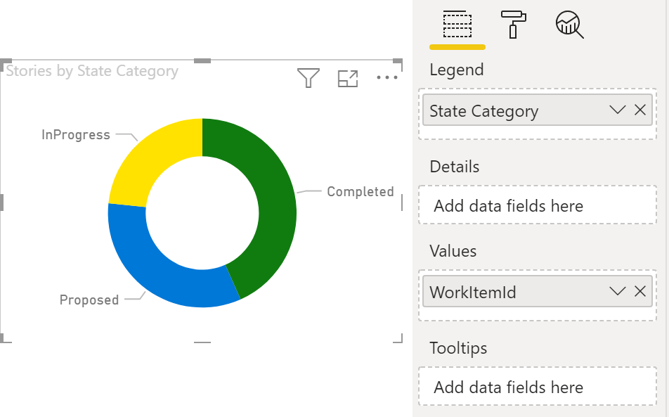
We also added a Stacked Bar Chart of Stories, using AssignedTo as the Axis, State Category as the Legend and Count of WorkItemId as the Value.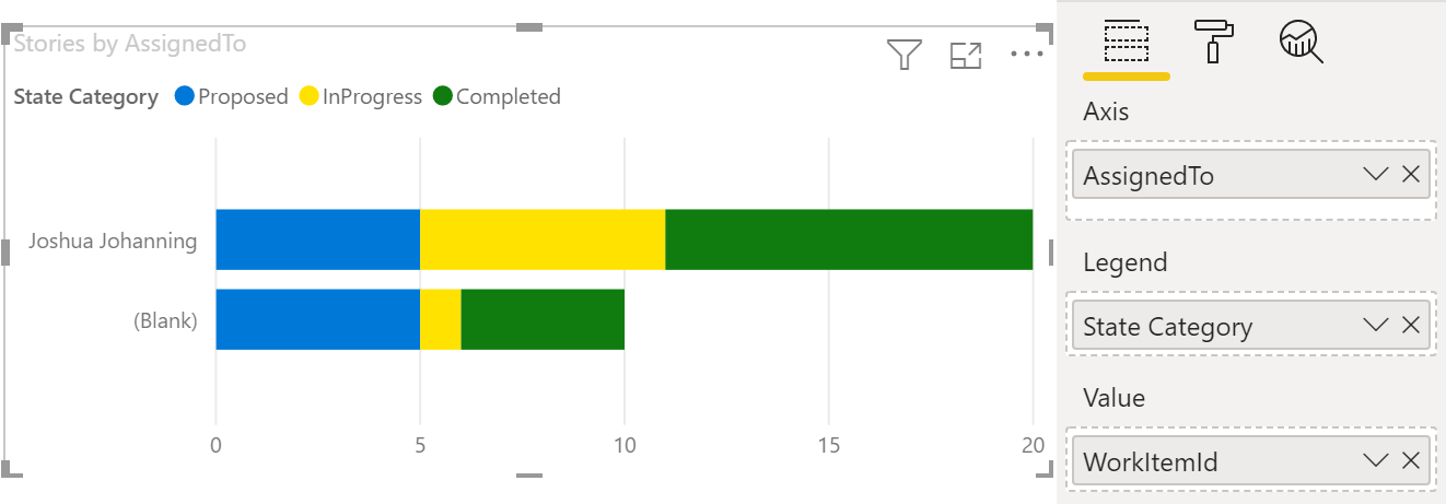
We also configured the colors to be Blue, Yellow, Green for Proposed, In Progress and Completed respectively on both charts.
The final chart we configured is a timeline - we’re actually using the Gannt Chart custom visual from the PowerBI gallery to render this: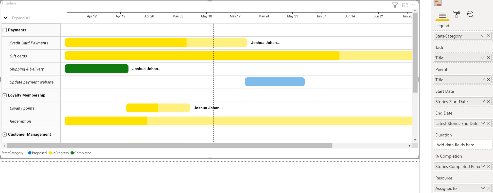
Here’s how we mapped the fields:
- Legend:
Features:StateCategory - Task:
Features:Title - Parent:
Epic:Title - Start Date:
Features:Stories Start Date - End Date:
Latest Features:Stories End Date - % Completion:
Features:Stories Completed Percentage - Resource:
Features:AssignedTo
This rolls up the Stories into a single bar per Feature. The color of the bar is determined by the state of the Feature. The completed percentage is the percentage of Stories for that Feature in the completed state. The start and end date are the earliest Iteration start and latest Iteration end date for all the Stories in that Feature. The resource is the AssignedTo (owner) of that Feature. And all these Features are grouped into their corresponding Epic (Parent).
Now you can click on a Feature in the Timeline and it will filter the remaining visuals! And you can of course use the slicers to get more specific on the work items you’re interested in viewing.
Conclusion
If you’re circumspect about how much data you’re grabbing from the OData endpoint, you can fairly easily create useful PowerBI reports for your work items. These can end up being better than widgets in Azure Boards Dashboards because you can slice and dice them more easily.
Happy reporting!