New Feature: Lightweight Query Charts in Web Access

I have installed TFS 2013 RC. I upgraded my TFS Express (that I use for mucking around with code) from TFS 2012.3 and everything went smoothly. I then opened up Web Access and was pleased to see one of the best features yet for TFS work items: lightweight charts.
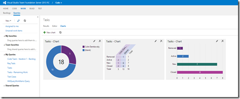
These charts allow you to quickly and easily create visualizations against your work item queries. Here is a “dashboard” against a query that lists “Tasks” in my Team Project:
Creating Charts
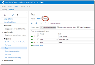
Creating charts is really simple. Navigate to Web Access and click “WORK” and then “Queries” to go to the query hub. Select or create create a query. Make sure you add any columns that you want to group by onto the query – for example, State, Assigned To or Iteration Path. Once you’ve saved your query, click on the “Charts” tab:
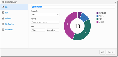
Now enter a name, select the chart type and the field to group by. For example, here I am doing a pie graph grouped by “State”:
You can also make a Pivot table – this allows you to select rows and columns. For example, here’s one showing Assigned To vs State:
Limitations
Unfortunately, you can only use “count of work items” as the value setting. I tried to see if I could add “Remaining Work” and show remaining work per user, but no dice at the moment. We’ll have to wait for a future update to get this sort of functionality.
Wish List
I’d love to see the ability to “Favourite” one of the charts so that it appears on the landing page. It would also be nice if you could edit the colours, add filters and email the charts (or at least a chart link). Also, you can’t drag-and-drop to re-order the charts. We’ll have to see what the product team gets time to actually squeeze into this feature.
In the meantime, happy charting!


